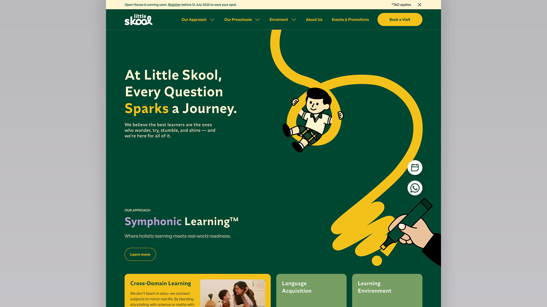
Helping parents understand a curriculum, compare centres and book a visit.
Little Skool is a Singapore preschool group, part of NTUC First Campus, running six centres islandwide for corporate and public families. Its website is where parents research the curriculum, compare centres and register interest before enrolling.
Client
Little Skool (NTUC First Campus)
Role
UI & Visual Design
Timeline
2025
URL
https://www.changemakers.edu.sg/explorer/
My contribution
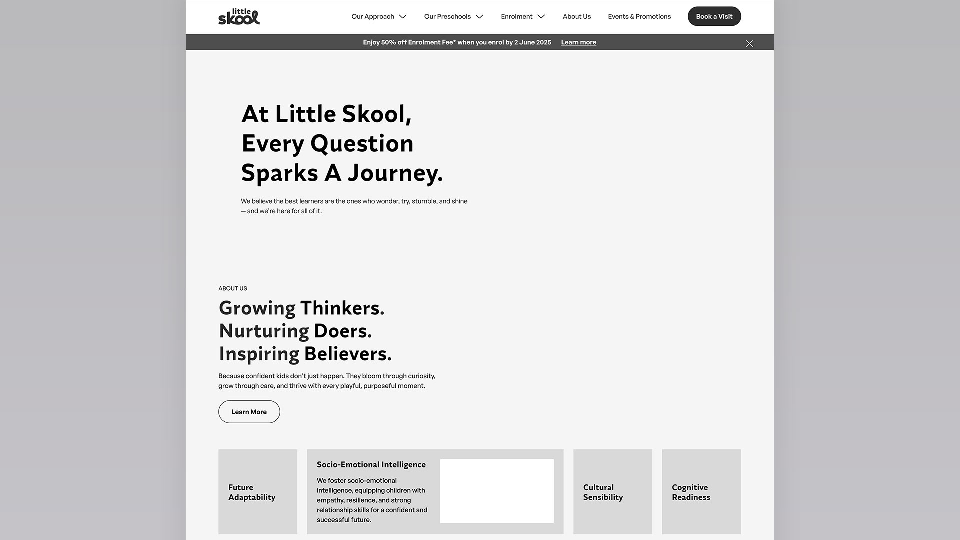
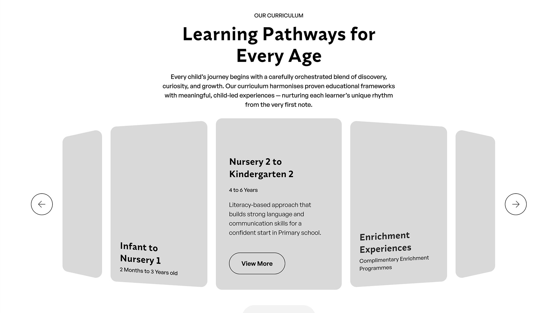
Wireframed the page templates at low fidelity, before any visual work.
Built new components inside the existing library, working to its naming and variant rules.
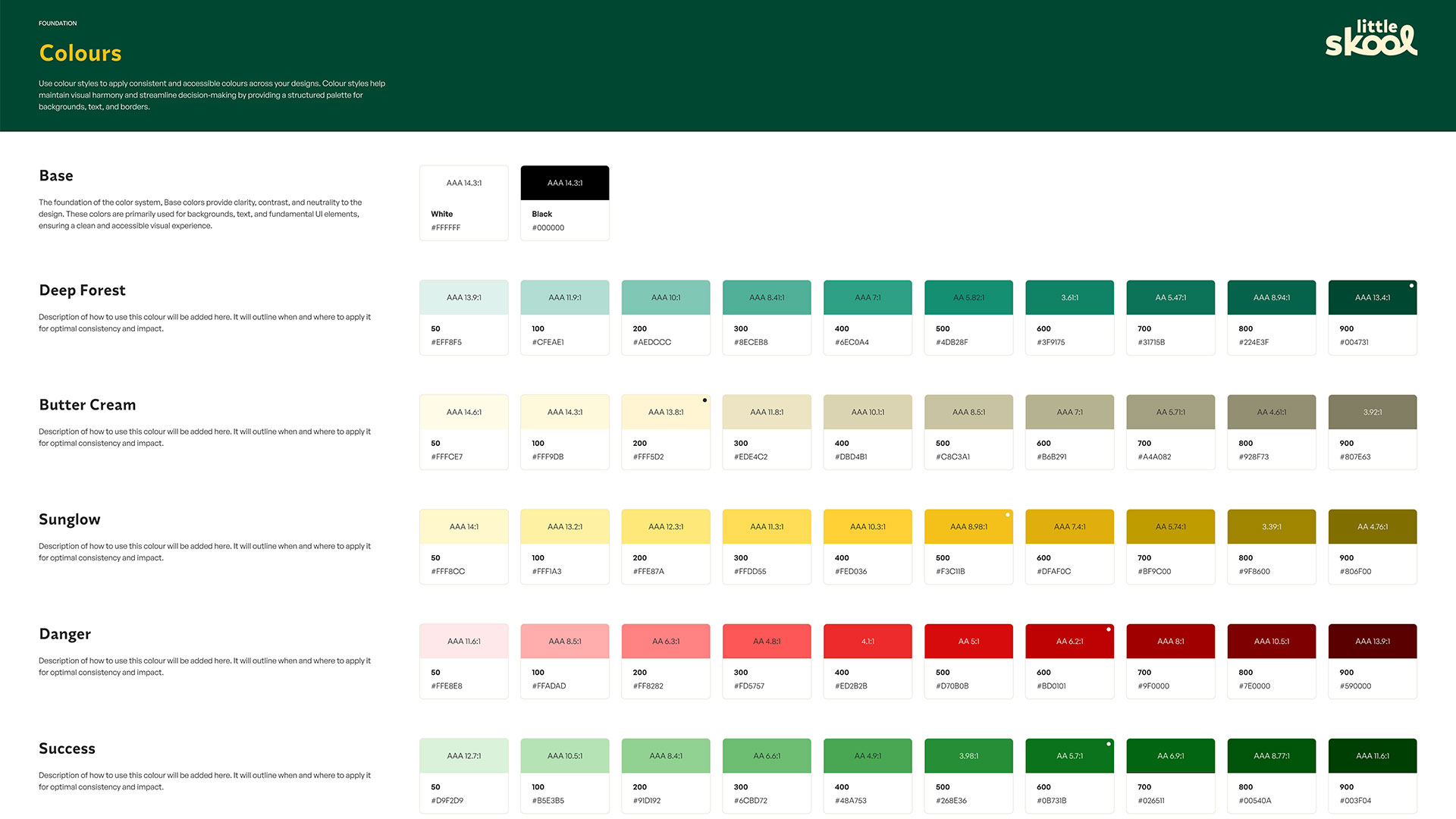
Made the tonal and colour calls as the palette was applied across components, states and pages.
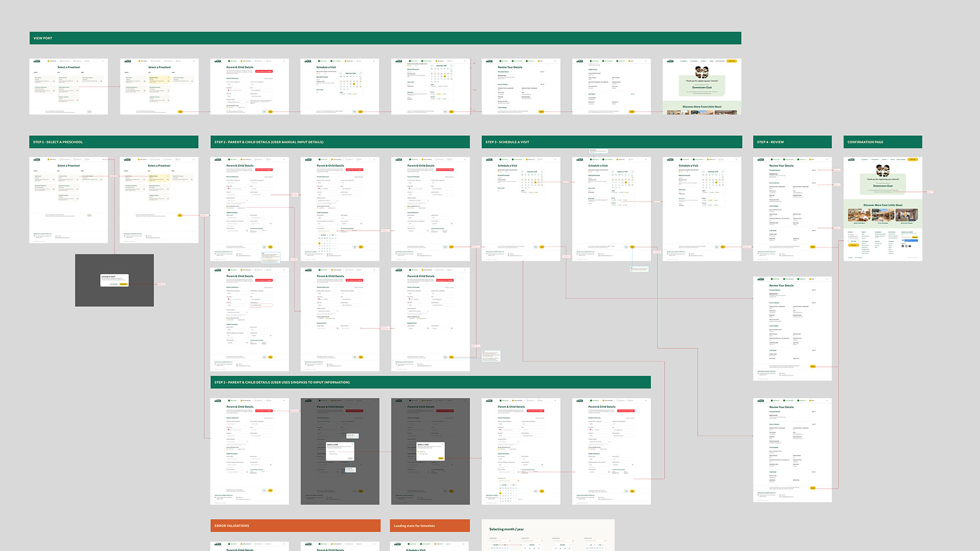
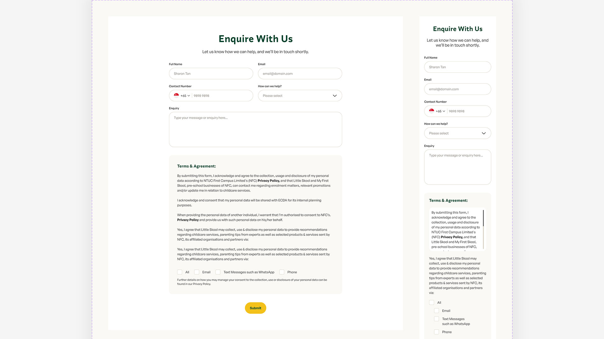
Designed the desktop and mobile screens, including the enrolment flow.
Constraints
Brand positioning, creative direction and the library's structure were all settled before I joined. My work sat on top of that — extending someone else's system rather than starting one, which is a different job with different rules.
After
Before
Project Objectives
Six centres, one set of layouts
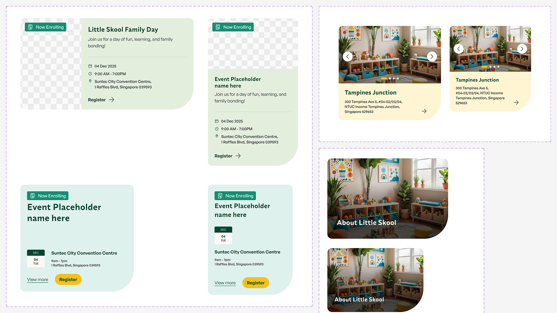
Each centre has its own address, fees and availability. That variation had to come through as content, not as a bespoke page per location.
Assemble pages, don't draw them
Too many screens across desktop and mobile to keep consistent by hand. If a new page is a configuration of existing sections rather than a fresh design, it stays consistent for free.
Wireframe before decorating
Structure got settled in grey boxes first, so the visual pass was applying a library rather than solving layout and hierarchy at the same time.
Where I came in
The positioning and the library were settled before the build started. My starting point was the inventory — the template list, six centres, two viewports and an enrolment flow — and what that volume meant for wireframing, component build-out and page design.
What the build had to account for
Content does the varying, not the layout
Six centres running through one page design. Whichever centre loaded, the layout had to hold — different address, different fees, different availability, same structure.
Two viewports, no drift
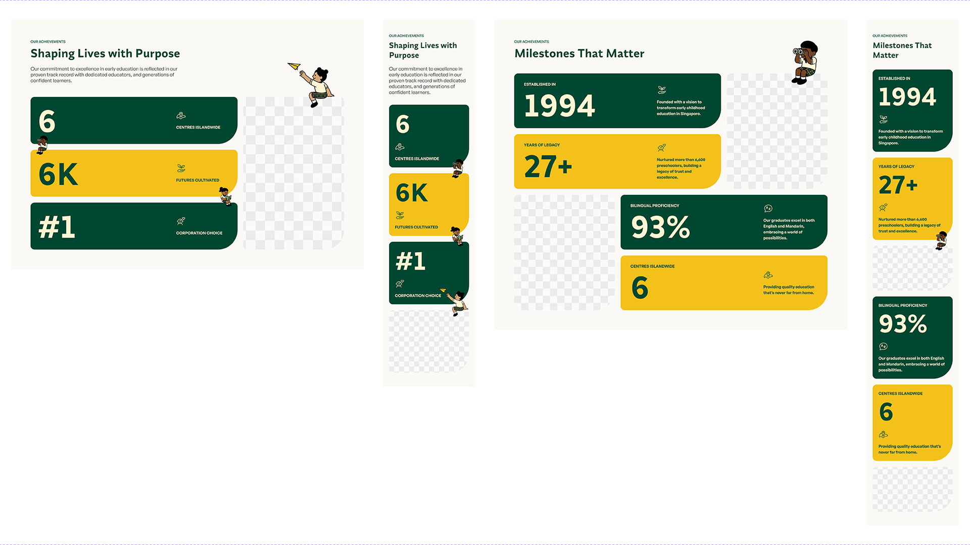
Every page existed at 1440 and 375. Keeping them in sync by hand was never going to hold, so the responsive behaviour had to sit inside the components rather than in the page.
Variants, not duplicates
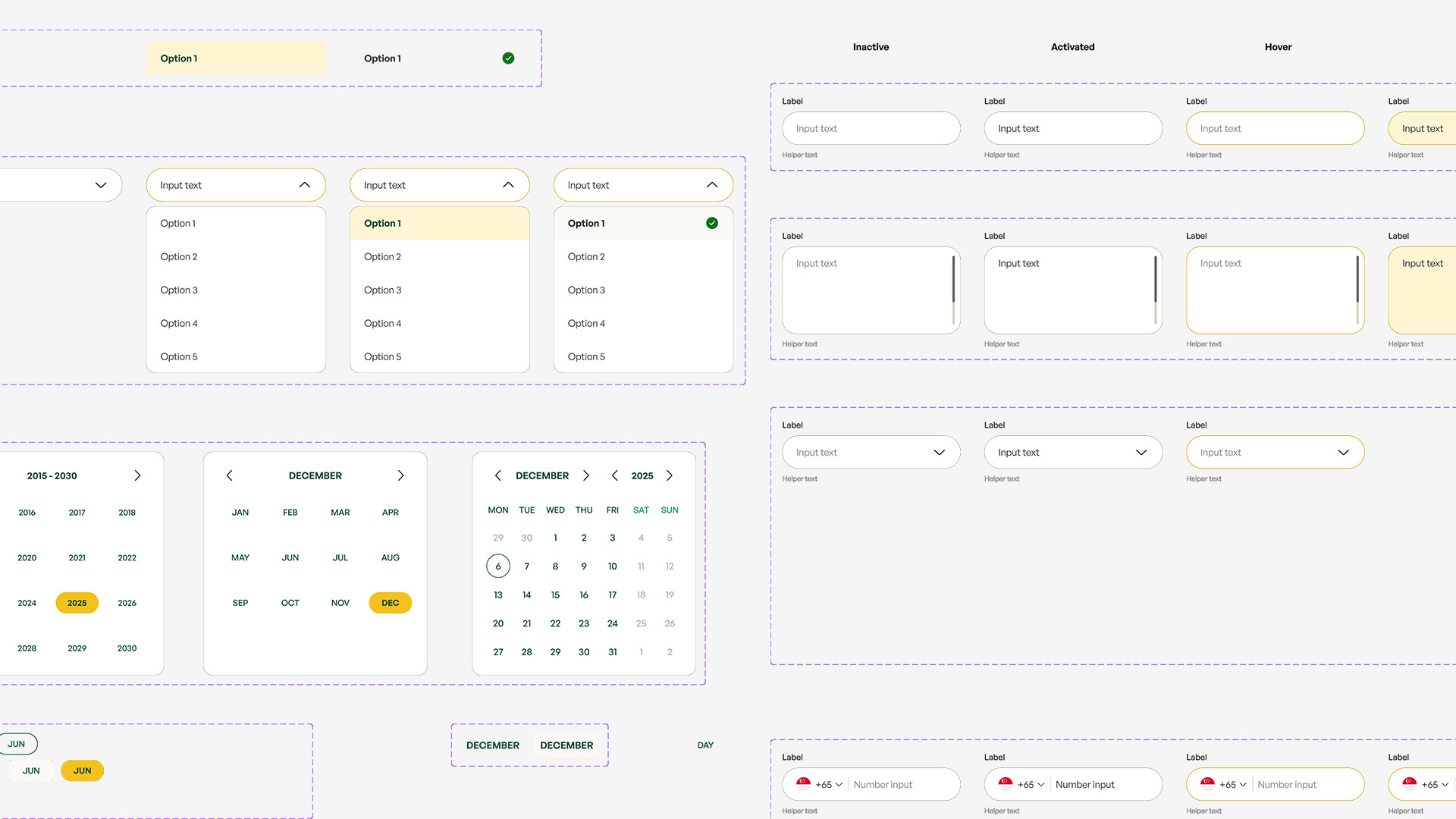
The library already had its own logic for inputs, forms and cards. Adding to it meant working inside that logic instead of starting a new pattern next to it.
The real work is in the enrolment flow
Prefill, child selection, date scheduling — and what each of those looks like when it fails.
Solutions
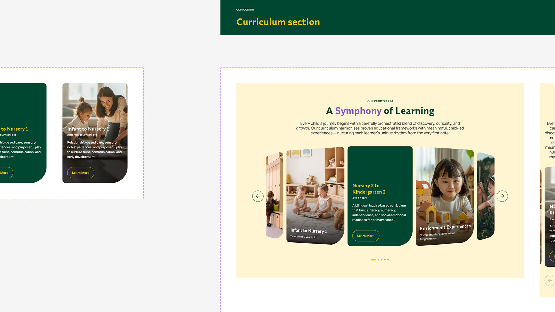
The library is layered. Foundations set colour, type, spacing and grid. Components cover the primitives — buttons, inputs, cards, chips, steppers, modals. Compositions assemble those into page sections, from the curriculum carousel to the schedule and map blocks. I worked in the component and composition layers, made the tonal calls as the palette met them, and designed the page screens built out of them.
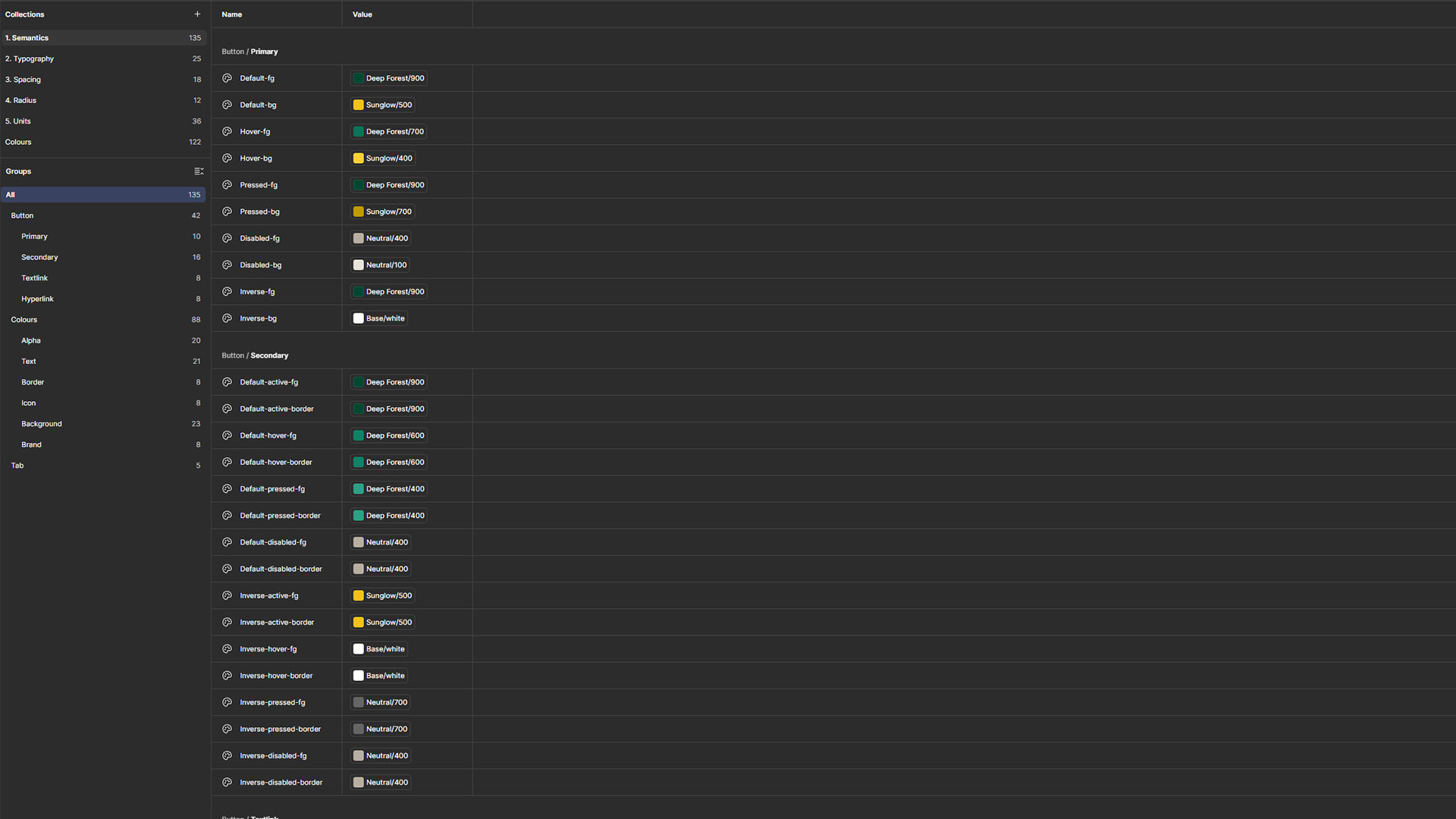
Design Tokens & Variables
Colour Foundations
Screen Map & User Flows
Registration Flow & Screens
Outcome
The library shipped as the client's working design system and the site is live at littleskoolhouse.com. Performance data sits with the client. The same component approach carried over to sister brand My First Skool, where I designed the equivalent enrolment screens.
Challenges
Building on a system already in flight
Adding to a live component set means matching its logic rather than improving on it. A new variant has to sit inside existing naming, structure and spacing rules. It's slower than building it your own way, and it's the difference between extending a library and quietly forking one.
Edge states, not happy paths
The enrolment flow only works if the failures are designed: an invalid date, a child record that does not match, a prefill that returns nothing. Those states are most of the work and none of the demo.
Colour you didn't choose
The palette came with the brand, built for marketing rather than for interfaces. Applying it across hover, disabled, error and success meant finding the tones that were missing and making them look like they'd been there all along.
Key Takeaways
Wireframes make the visual pass cheap
Settling structure at low fidelity meant the design stage was applying a library rather than solving hierarchy and layout at the same time. Across a set that size, that difference compounds.
Responsive belongs in the component
Two viewports only stayed in sync because the compositions carried their own breakpoint behaviour instead of being redrawn at 375.
Extending well is the harder skill
Inventing a system is a greenfield exercise. Adding to one without degrading it means working to someone else’s naming, variant logic and spacing rules while still making real calls inside them. That is what keeps a library alive after the people who wrote it move on.
Disclaimer: All works and images belong to their respective owners.