

Skip links
The Esplanade dome against a blue sky
Close view of the anodised aluminium sunshades on the Esplanade dome
The underside of the Esplanade dome lit at night
Scroll down circular graphic

Esplanade

Singapore Singapore

Website Restructure & Redesign

Bringing a national arts centre's programme and editorial into one journey.

Esplanade – Theatres on the Bay is Singapore’s national performing arts centre. It presents a year-round programme across concert halls, theatres, studios and free public spaces, alongside education, outreach and venue hire, serving audiences, artists, schools and donors from a single site.

Client

The Esplanade Co Ltd

Role

Senior Experience Designer

Timeline

2025

URL

https://www.esplanade.com

My contribution

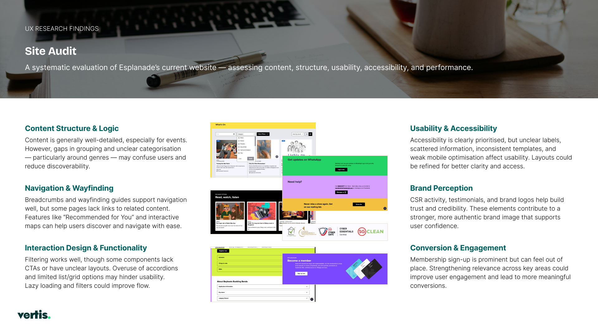
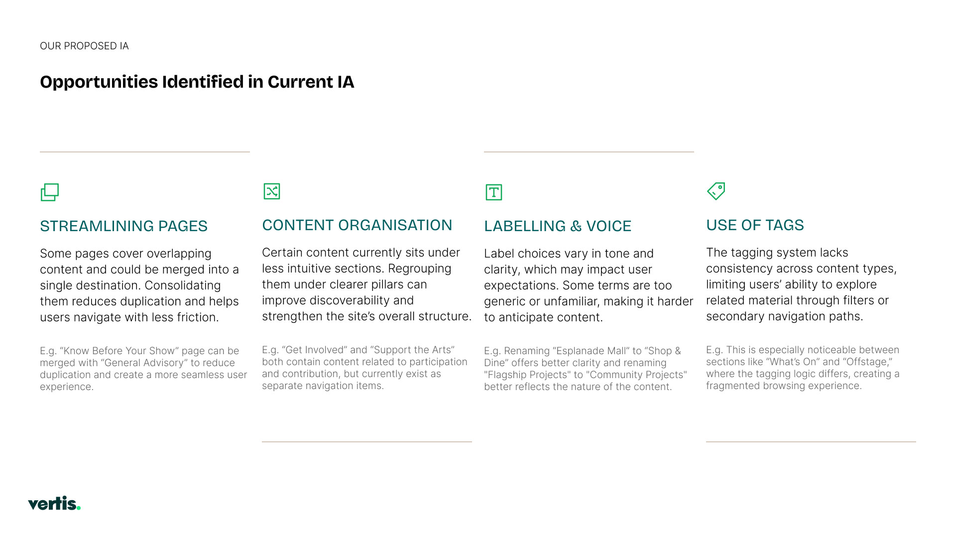
Audited the existing site and mapped where its journeys broke — overlapping pages, unintuitive grouping, inconsistent labelling, siloed tagging.

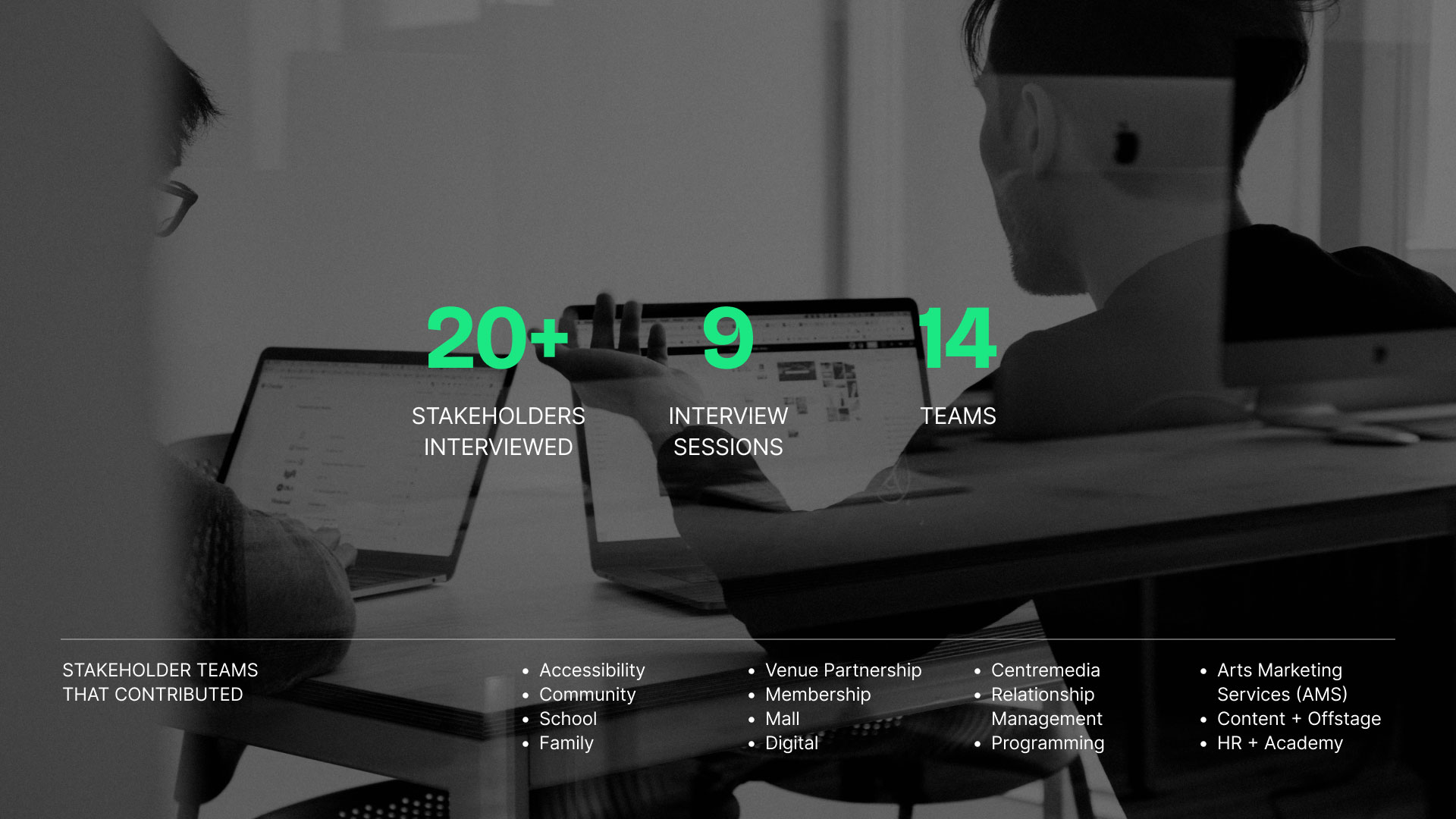
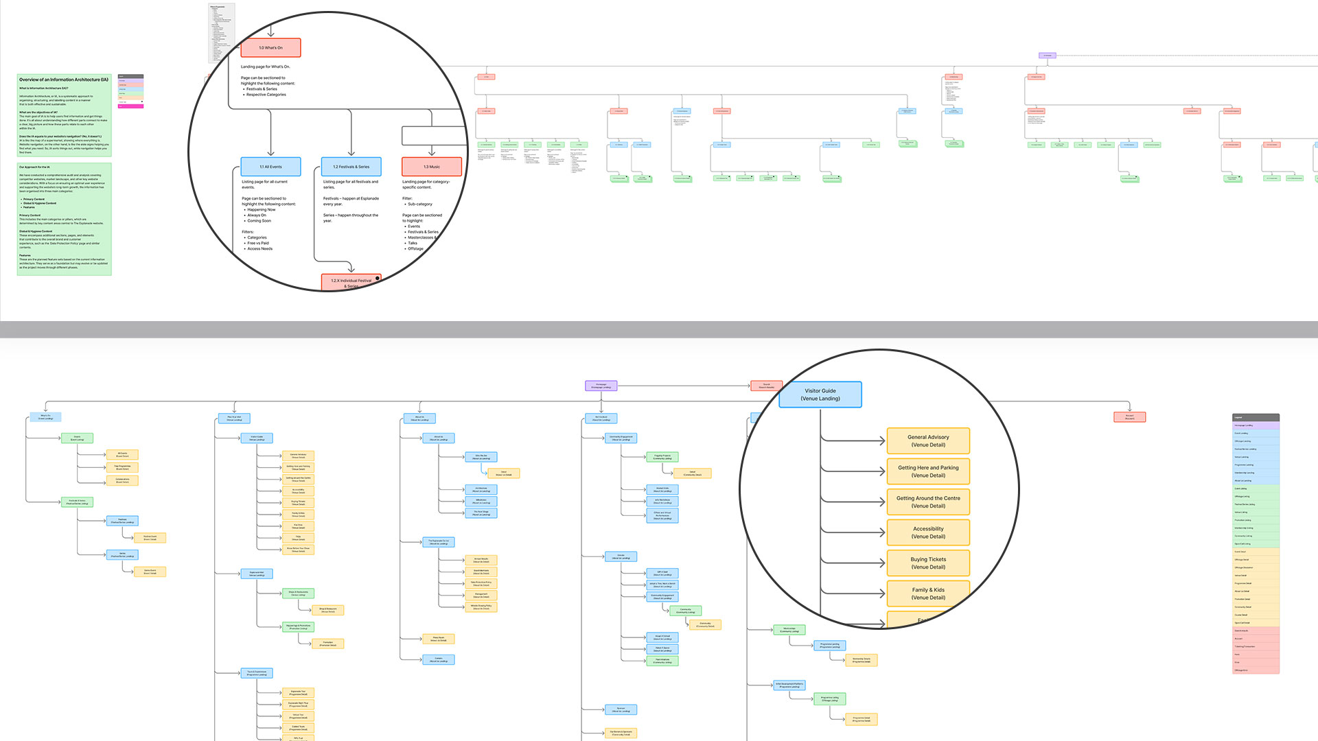
Synthesised nine stakeholder sessions across 14 teams into a proposed information architecture covering around 92 pages.

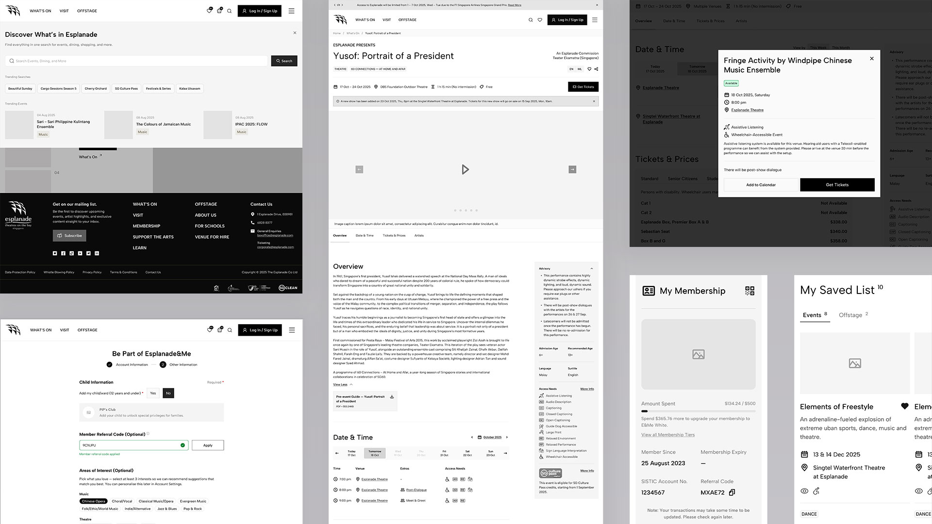
Wireframed batches of page templates plus global navigation and footer, at low fidelity, before any visual work.

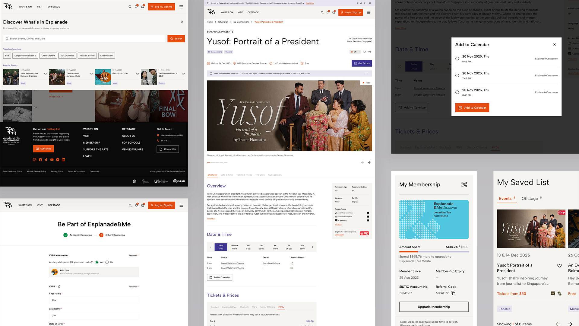
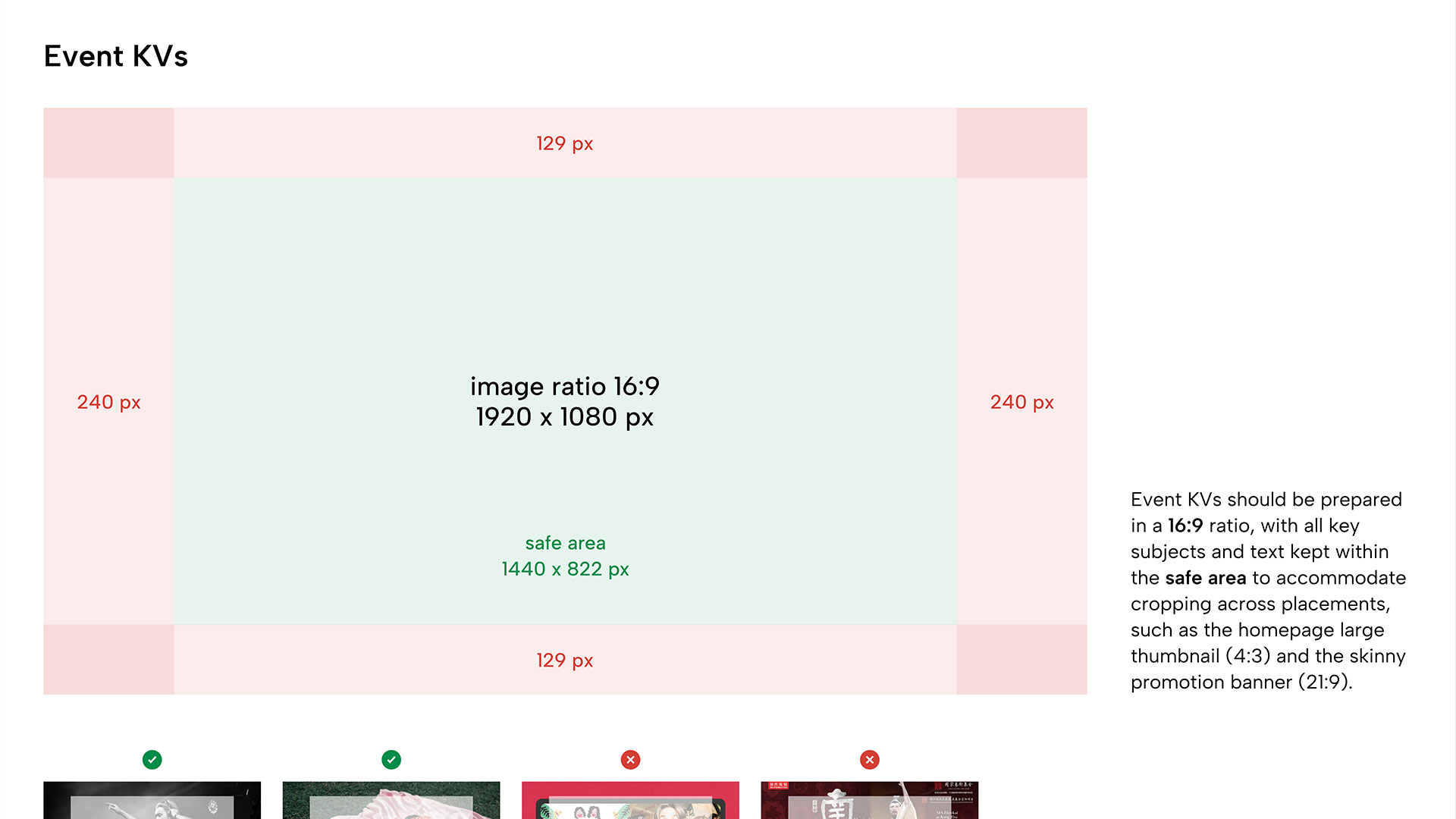
Assisted with visual design of pages for high-fidelity mockups including maintenance and building of design libraries.

Constraints

The site runs on Sitecore Cloud, with ticketing on a separate platform and content authored by teams across programming, marketing, education and venue hire. Every stage — IA, wireframes, visual direction, page layouts — was formally approved before the next began.

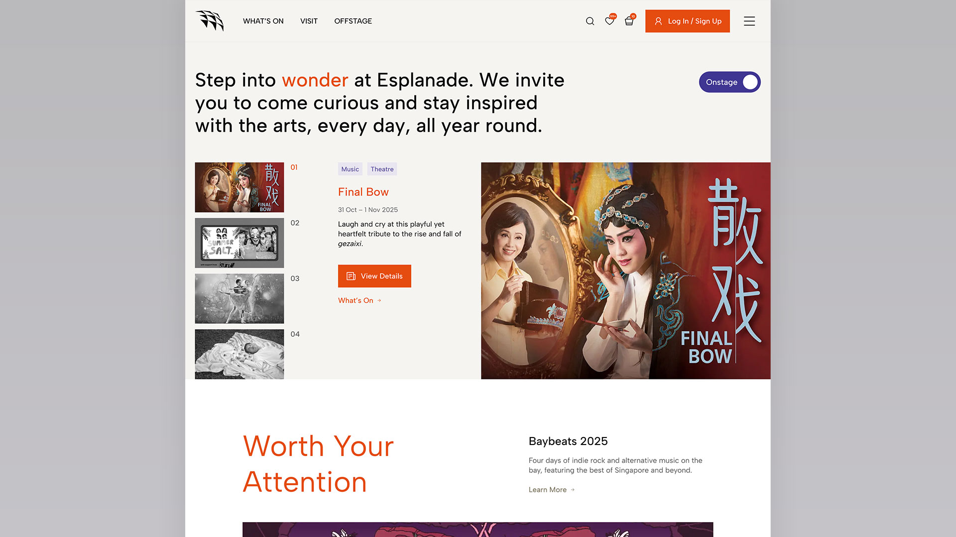
After comparison of the Esplanade homepage After
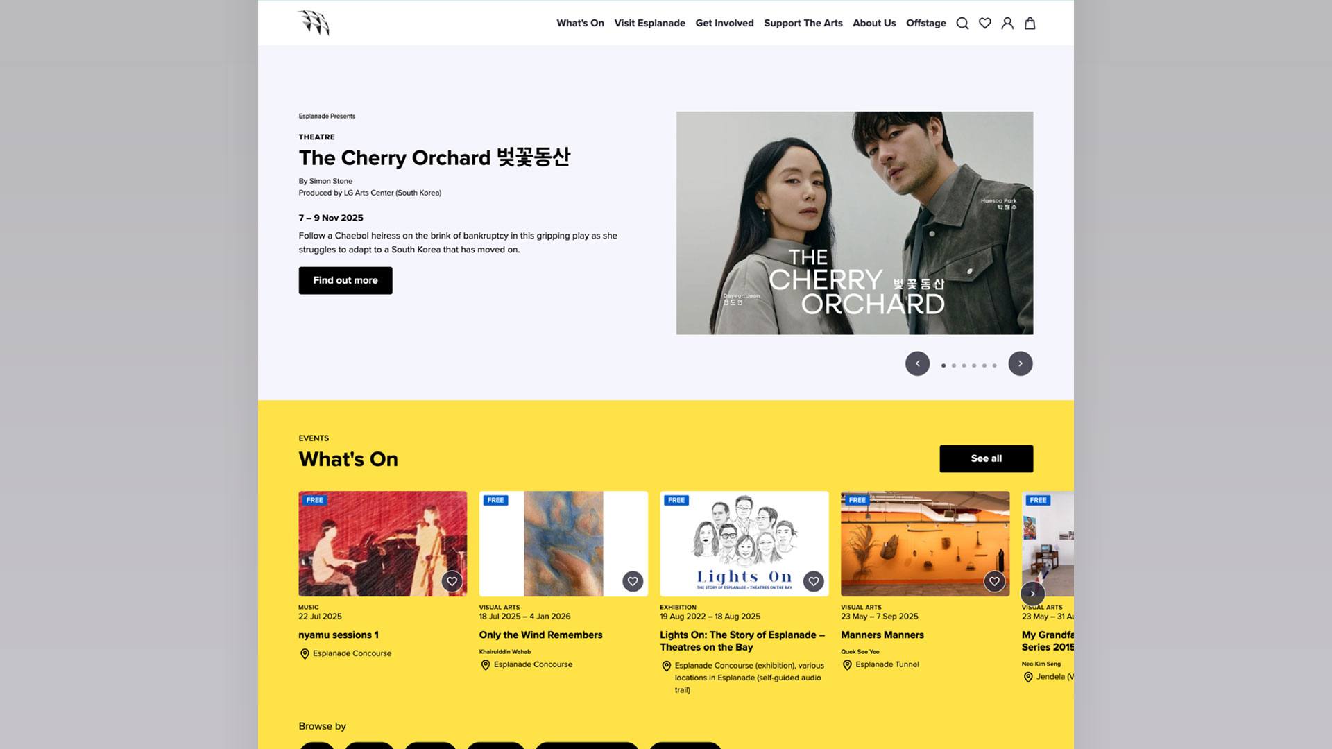
Before comparison of the Esplanade homepage Before

Project Objectives

Repair a journey split across the site

Related content sat in different places under different labels, and tagging never reached the browsing experience. The task was to regroup around 92 pages so a single intent could be followed in one path instead of four.

Design layouts that hold at scale

62 page sections across four delivery batches, authored by four different teams. Layouts had to be flexible enough for programming, marketing, education and venue hire, and constrained enough that the site still read as one thing a year later.

Keep accessibility in the structure, not the polish

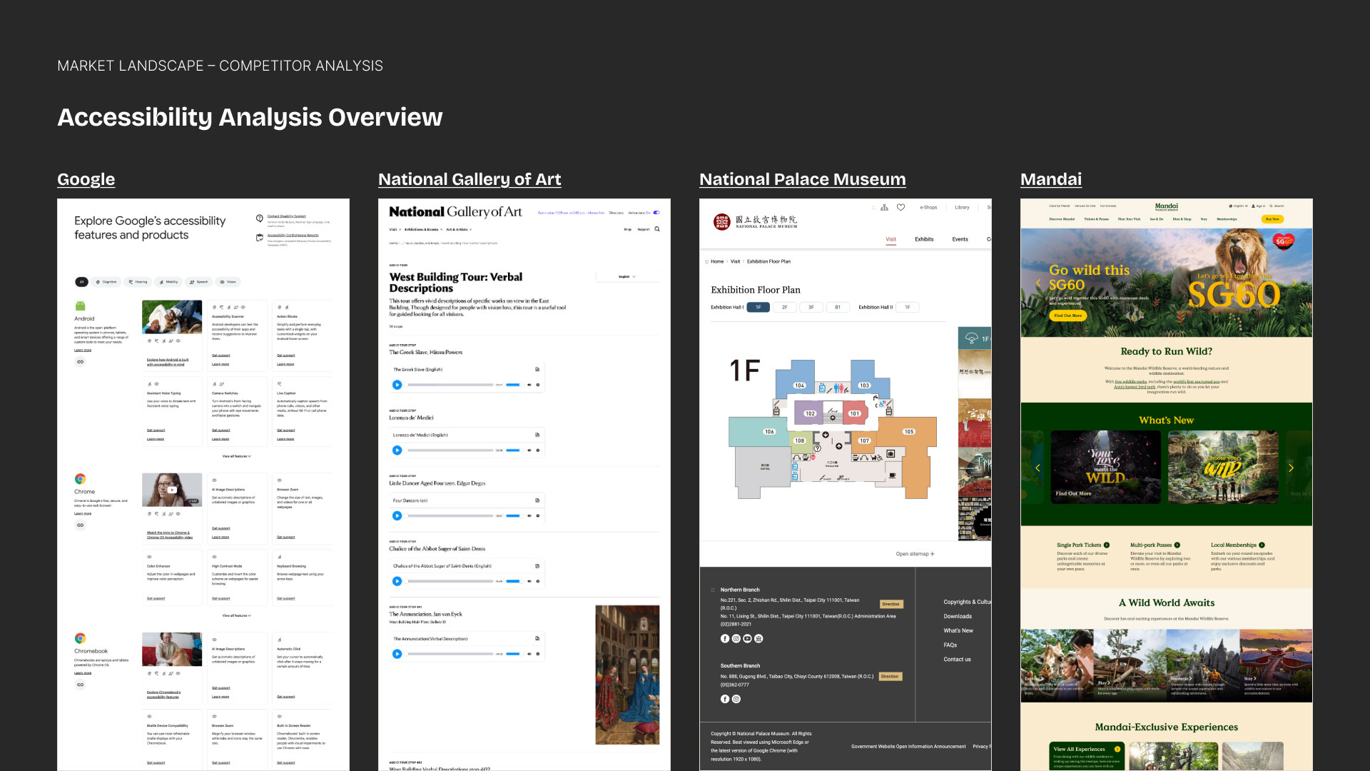
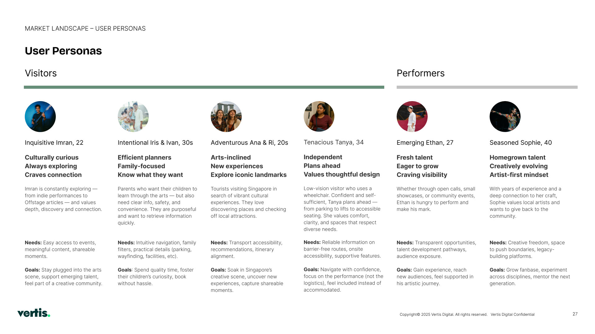
A national arts centre carries a statutory duty of access. Accessibility ran as its own research track with its own competitor set and persona, so access information landed in the layout rather than being bolted on at the end.

Early Insights

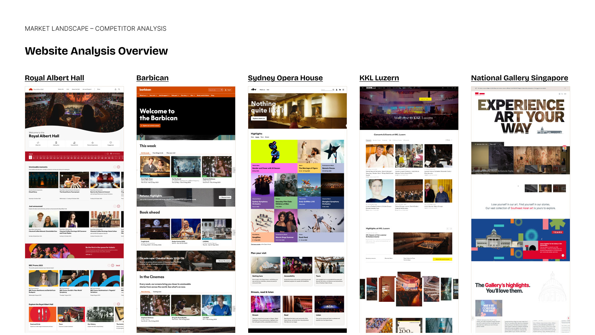
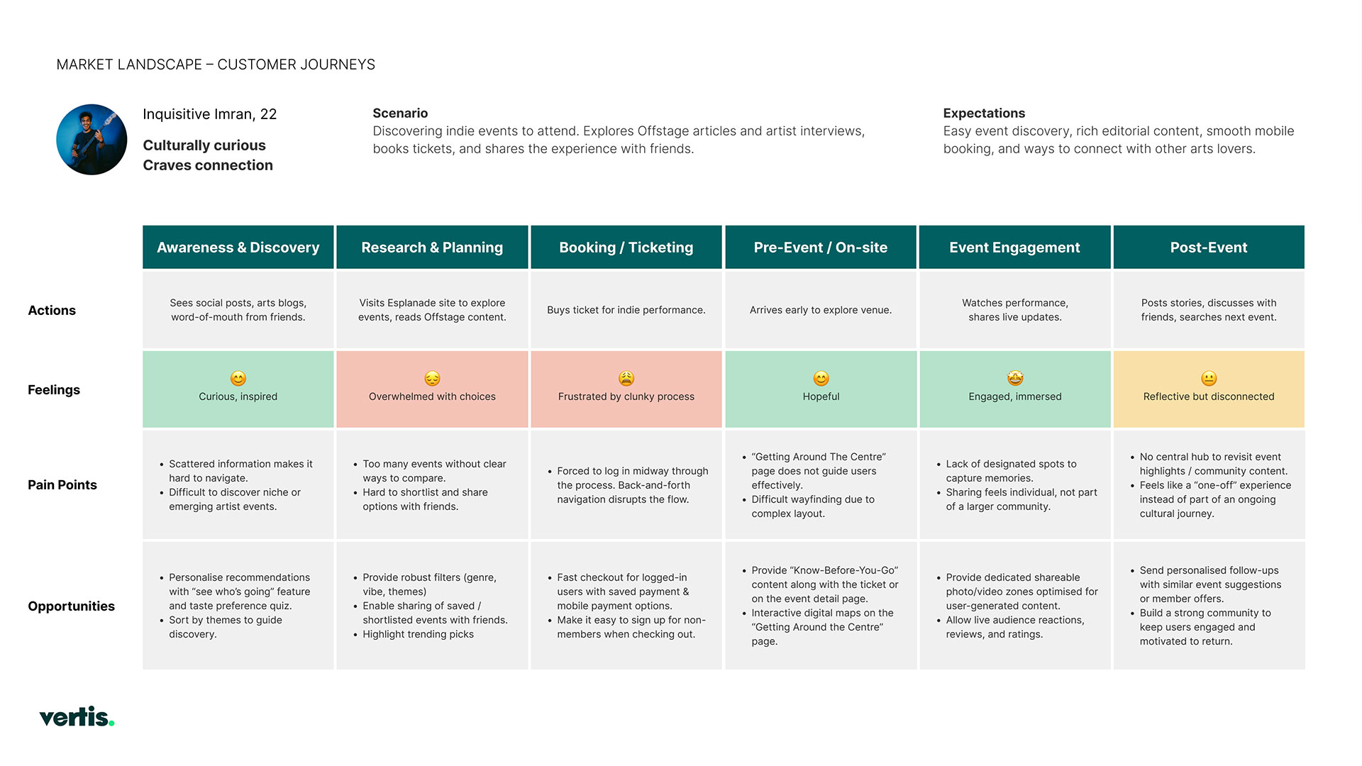
We audited the current site end to end, benchmarked five arts venues on discovery and four non-arts sites on accessibility, ran nine stakeholder sessions across 14 teams, and built four personas with full journeys before proposing a structure.

Things we found through our discovery sessions

Pages that overlapped

"Know Before Your Show" and "General Advisory" covered the same ground; "Get Involved" and "Support the Arts" both held participation content. Same intent, four destinations.

Filed by department, not by interest

"Naming conventions are very functional — they don’t mean anything to people who don’t know what we do." Content sat under internal structures rather than what someone was looking for.

Tagging never left the CRM

Tags were applied differently across platforms and stayed siloed, so related content never surfaced while browsing.

Nothing answered "what’s on today"

Visitors could not see across shows, exhibitions and venues at a glance, which is the most common thing they arrive wanting.

Offstage lived apart

Editorial built real interest in artists and works but sat outside the event pages it could have been selling.

Access information had no shop window

It existed, but never appeared on event cards or detail pages — so it was invisible at the exact moment someone decides.

Solutions

Structure first, screens second. An information architecture argued against four named problems in the old one and approved before a single layout was drawn. Wireframes at low fidelity to test the structure. Three visual routes narrowed to two, then resolved into a palette and type system. Then the build itself, delivered in four batches, with every template mapped back to its components so it could be tested piece by piece rather than page by page.

Information Architecture & Sitemap

Information Architecture & Sitemap

Wireframes

Wireframes

Visual Design

Visual Design

Delivery & Handover

Delivery & Handover

Outcome

The restructured site is live on Sitecore Cloud. The approved information architecture is visible in the navigation today — What’s On, Visit, Membership, Support the Arts, Learn, Offstage, About Us, For Schools and Venues for Hire. Performance data sits with The Esplanade Co and is not public.
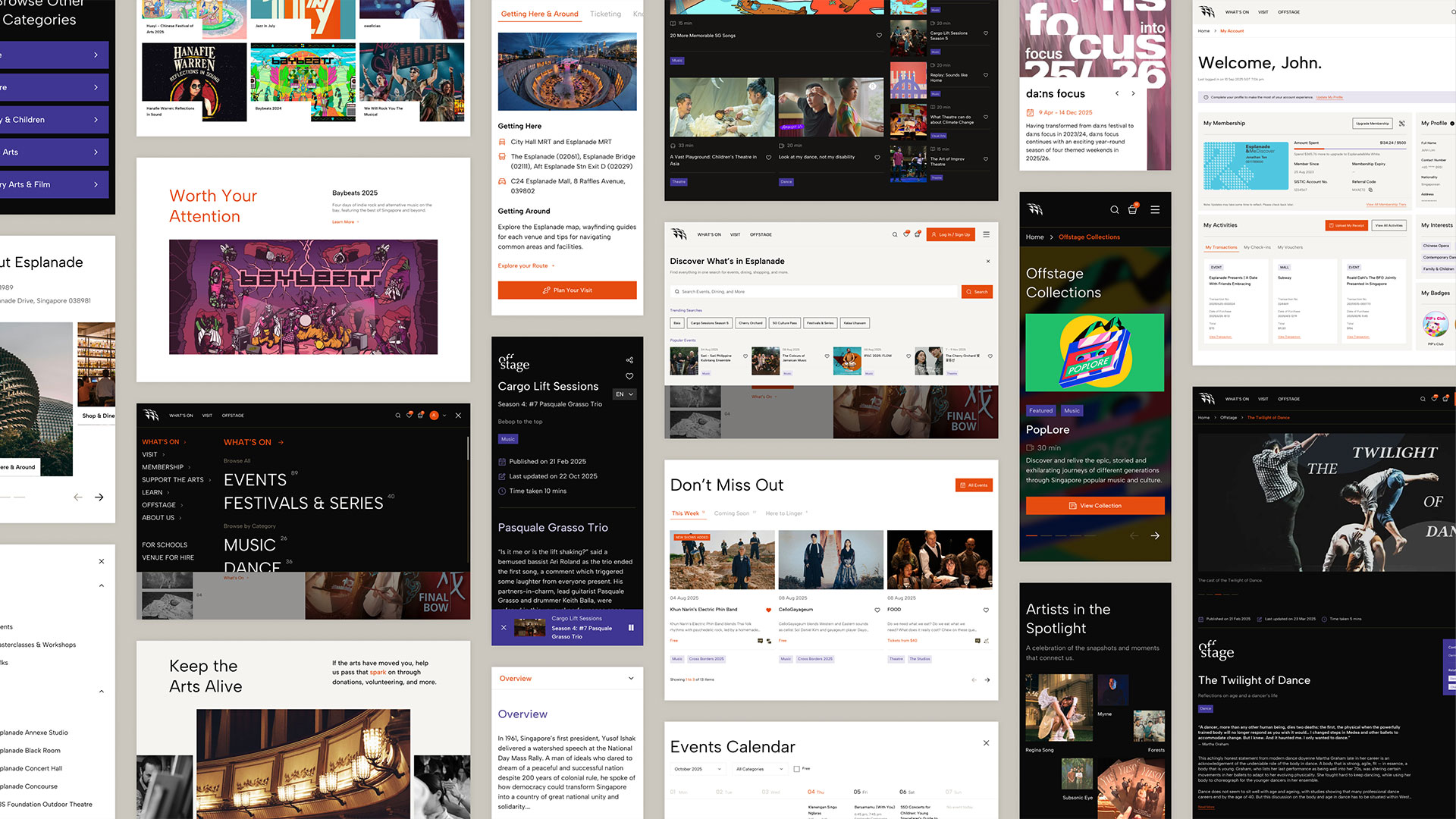
Montage of redesigned Esplanade page templates across What's On, Visit, Offstage and Membership

Challenges

Approval before progress

Every stage was formally gated. Half of each deck’s job was making the decision explicit — telling stakeholders what they were being asked to judge and what they were not — before the next stage could start.

14 teams, one structure

14 teams contributed requirements and four publish daily into the same layouts. Regrouping content meant relabelling pages that specific departments had owned for years.

Restructuring a site that never stops

Hundreds of events cycle through each year. The new structure had to absorb that churn without anyone having to redesign a page to accommodate it.

Key Takeaways

Argue the structure, do not assert it

Naming specific problems in the old IA and answering each one is what got a 92-page restructure approved without re-litigating it six weeks later.

Layout is where fragmentation actually shows

Related content sitting in different places is an IA problem, but people only experience it as a page that does not have what they came for.

Accessibility belongs upstream

Running it as a parallel research track meant access cues landed in the card and detail layouts, and every candidate accent colour was contrast-tested before selection rather than after.

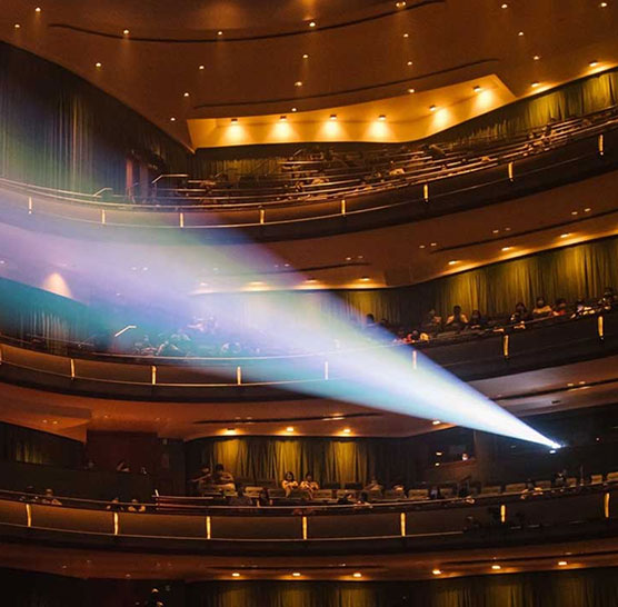
A beam of light crossing the auditorium of the Esplanade Concert Hall

Awards

The restructure took SG Mark 2026 for Digital Design, one of six winners in the category.

Winner

Winner

SG Mark 2026 (Singapore Good Design), Digital Design — one of six winners in the category

Read More

Disclaimer: All works and images belong to their respective owners.

View
Drag